App Store Screenshot Strategy: What Your Competitors' Screenshots Actually Tell You
App Store Screenshot Strategy: What Your Competitors' Screenshots Actually Tell You
Screenshot decisions in most growth teams are made by eye: look at what competitors are doing, make a cleaner version of it, ship it. That process has a name. It is called converging on convention. It is the opposite of strategy.
When every app in your category uses the similar layout, the similar color palette, and the similar narrative structure, the marginal gain from a "better design" approaches zero. The real gain comes from finding the positioning gap no competitor owns and testing whether users respond to something different. This post walks through the exact system for doing that, from pulling competitor data to running a test that delivers statistically meaningful results. If you are running an app that just hit traction, or leading a small growth team where screenshot tests have started to feel surface level, this post is written for you.
Why Screenshot Analysis Is Strategy Work, Not Design Work
Screenshots and the app icon are the two most influential conversion assets on your App Store listing. In most cases, the first three screenshots determine whether a user installs or leaves. That is a high-stakes decision point, and in most categories, it is handled with almost no competitive intelligence.
The problem is not effort. Teams spend real time on screenshots. The problem is the frame. When you evaluate a screenshot as a design artifact, you ask whether it looks good. When you evaluate it as a positioning statement, you ask what claim it makes and whether any competitor has left that claim unclaimed. Those are completely different questions, and only one of them leads to a testable insight. This is the line between design work and strategy work, and it is why teams on the wrong side of it quietly fall behind. "Look at competitors, polish what exists, ship" is not a strategy. It is a follower loop, and follower loops guarantee you never move further than the pack moves.
The shift that changes outcomes: stop evaluating screenshots as design artifacts and start reading them as positioning statements. Every screenshot set answers three questions on behalf of the app:
- What problem does this app solve?
- Who is it for?
- Why is it better than the alternatives?
When you read competitor screenshots through this lens, patterns emerge fast, and so do the gaps.
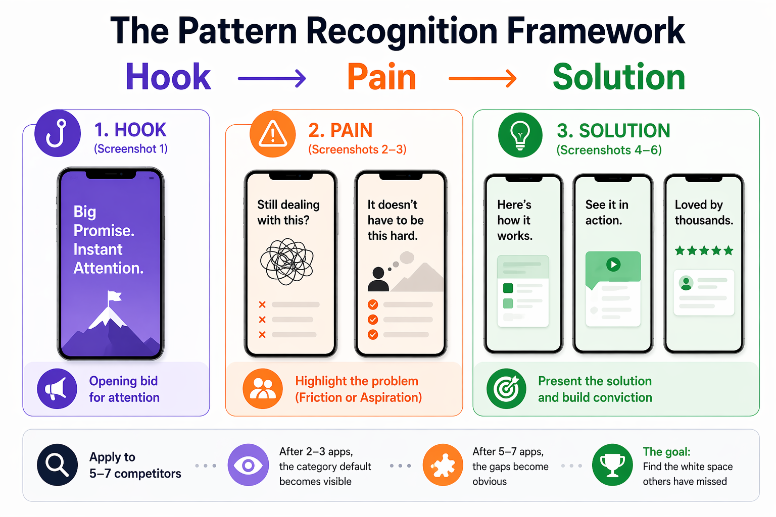
The Pattern Recognition Framework: Hook → Pain → Solution
Competitor screenshot analysis becomes actionable when you apply a consistent structure to every app you evaluate. This framework breaks each screenshot set into a three-part narrative:
Hook (Screenshot 1): What promise does the first image make? Is it a feature statement, an outcome, or an emotional transformation? This is the app's opening bid for attention.
Pain (Screenshots 2–3): Which user problem is being highlighted? Does the app lead with friction (something the user is struggling with) or aspiration (something the user wants to achieve)? These two framings attract different users.
Solution (Screenshots 4–6): How does the app present its answer? Feature list, use-case demonstration, social proof, before/after transformation, or metric-based credibility?
Apply this framework to 5–7 direct competitors. Document it in a simple table, app name across the top, narrative structure down the side. After two or three apps, the category default becomes visible. After five to seven, the gaps become obvious.
Step-by-Step: Running a Competitor Screenshot Audit
Step 1 — Pull and Document Competitor Screenshot Sets
Gather the current screenshot sets for your top 5 to 7 competitors. Take screenshots of each full set (typically 4 to 6 images per app). Store them in a shared folder organized by competitor name.
OWA AI accelerates this step by running the Hook → Pain → Solution breakdown across your competitor set automatically and surfacing the positioning gaps for you, which is the actual output this step is working toward. You can also pull historical versions of competitor sets to see when they last updated their creative and whether those updates tracked with ranking shifts.
Step 2 — Map the Narrative Structure
For each competitor, document:
Screenshot 1: What is the opening promise? (Feature / Outcome / Transformation / Identity)
Screenshots 2 to 3: What problem is being positioned against? (Specific pain / General aspiration / Social proof)
Screenshots 4 to 5: How is the solution framed? (Feature list / Use case / Metric / Testimonial)
Screenshot 6: Is there a closing statement, CTA, or final positioning?
Write one sentence per screenshot. Not a design critique, a positioning observation. "Blue header, bold feature list, no user context" is a design note. "Positions against time waste; assumes users already know they need a productivity tool" is a positioning note.
If you want to skip the manual mapping, here is a prompt you can drop into ChatGPT, Claude, or any other model, along with the competitor screenshot images. You can copy it inline below, or download both chained prompts as a single file here.
"Act as an ASO positioning analyst. For each set of app screenshots I share, map the narrative using this structure:
Screenshot 1: opening promise (Feature / Outcome / Transformation / Identity)
Screenshots 2 to 3: problem being positioned against (Specific pain / General aspiration / Social proof)
Screenshots 4 to 5: how the solution is framed (Feature list / Use case / Metric / Testimonial)
Screenshot 6: closing statement, CTA, or final positioning
Give me one sentence per screenshot, written as a positioning observation, not a design critique. Keep all competitor outputs in the same thread so we can compare across them later."
For a more structured version of this workflow, we've packaged it as a reusable skill: [skill link].
Step 3 — Identify the Category Default and the Gaps
After mapping 5 to 7 competitors, ask:
- Which pain points appear in 80% or more of screenshot sets? This is the category's assumed narrative, the problem everyone thinks this category solves.
- Which angles appear in fewer than 20% of sets? These are underexploited positions.
- What visual language dominates? Color, layout, typography, and tone all pattern. Differentiation on any one of these creates immediate perceptual contrast.
- What kind of user does the category implicitly target? Often every competitor targets the same assumed persona, and a different persona may be available and underserved.
The gap between the dominant narrative and the unused positioning space is your strategic brief. It tells you not just what to design differently, but what story to tell that no one else is telling.
If you ran the Step 2 prompt in a chat thread, continue in the same conversation with this follow-up so the model has full context on every competitor it just mapped:
"Now that you've mapped all competitors, analyze the set as a category. Answer these four questions:
- Which pain points appear in 80% or more of the sets? This is the category default narrative.
- Which positioning angles appear in fewer than 20% of the sets? These are the underexploited positions.
- What visual language dominates across the category? (Color, layout, typography, tone.)
- What user persona does the category implicitly target, and what persona is absent?
End with one sentence naming the single largest positioning gap, the one most worth testing."
Step 4 — Build a Test Brief
Before opening a design tool, write a one-page brief that answers:
- What is the category default narrative?
- What positioning gap did the audit reveal?
- What is the hypothesis? ("Users who search for [keyword] are not being addressed on their actual pain point. If we reframe our first three screenshots around [specific gap], CVR will improve because...")
- What is the control? (Your current set, or the category default)
- What is the test? (The gap-based variant)
- What metrics define success? (CVR lift, statistical confidence threshold, minimum test duration)
This brief keeps the test honest. Without it, teams tend to revert to design discussions once the work begins, and the strategic rationale gets lost. For a walkthrough of what a complete test brief looks like inside OWA AI, see this short video here.
Step 5 — Run the Test
Use Apple's Product Page Optimization (PPO) in App Store Connect to run the A/B test. PPO lets you test up to three treatment variants against your control, with configurable traffic splits.
Minimum test duration: 2 to 4 weeks, depending on your download volume. For statistical confidence, you need enough install events to detect a meaningful CVR difference, typically 95% confidence or above before drawing conclusions.
Track:
- Conversion rate (impressions to installs)
- Tap-through rate (TTR) from search results
- Performance segmentation by traffic source (search vs. browse vs. referral)
What This Looks Like in Practice
In a productivity app category, an audit of seven competitors revealed the following category default:
- Blue and white color palette (six of seven apps)
- Feature-list layout, bulleted benefits with UI screenshots behind them
- Corporate tone, efficiency-focused language, no personality
- Hook framing: "Get more done" or "Stay organized"
- Category CVR baseline: approximately 5.1%
The gap: no app in the category was using a transformation-based narrative. Every app assumed the user already believed they needed the product and was selling features. No app was addressing the actual friction, the feeling that productivity tools create more overhead than they eliminate.
Test brief: reframe screenshots around the transformation (before/after emotional state), shift visual language to create immediate contrast (yellow background vs. universal blue/white), and remove feature lists entirely from the first three images.
Results after four weeks:
- Control (category default approach): 5.07% CVR
- Test (transformation narrative, visual differentiation): 5.88% CVR
- Lift: +16%
The product did not change. The metadata did not change. Only the positioning changed, and specifically, it changed in the direction of the gap no competitor occupied.
The 16% lift was not a design improvement. It was one of many small gains in an “inch game,” a consequence of having a clear strategy.
The Three Reasons This Approach Works Now
1. Pattern analysis at scale has become systematic
Five years ago, running this kind of competitive audit meant manually pulling screenshots from the App Store, building your own comparison grid, and doing the pattern analysis entirely by eye. That took days. Today, ASO platforms surface competitor creative assets, track historical changes, and flag category-level shifts. The analysis that used to take a week can be done in an afternoon, which means teams can run it continuously, not just at launch.
2. Creative differentiation is structurally undervalued
Conversion rate optimization in most mobile teams focuses on metadata and keyword targeting. Screenshots get updated when they look "outdated", a design trigger, not a strategic one. This creates a persistent category-level pattern: all apps in a mature category converge on the same visual language, because each team is updating their assets in response to what competitors are doing rather than in response to user behavior data. The result is a market where differentiation is available to anyone willing to look for it systematically.
3. Screenshot tests are the fastest, cheapest positioning experiments available
A product change takes quarters. A metadata change takes weeks and carries ranking risk. A screenshot test via PPO takes days to set up, delivers results in 2–4 weeks, and leaves your metadata and ranking signals completely untouched. For the speed and cost of the feedback loop, screenshot testing has no equivalent in the growth toolkit.
Teams winning at ASO right now are not the ones with the strongest designers. They are the ones who have figured out that screenshots are positioning work and that positioning decisions should be driven by competitive intelligence, not by aesthetic preference.
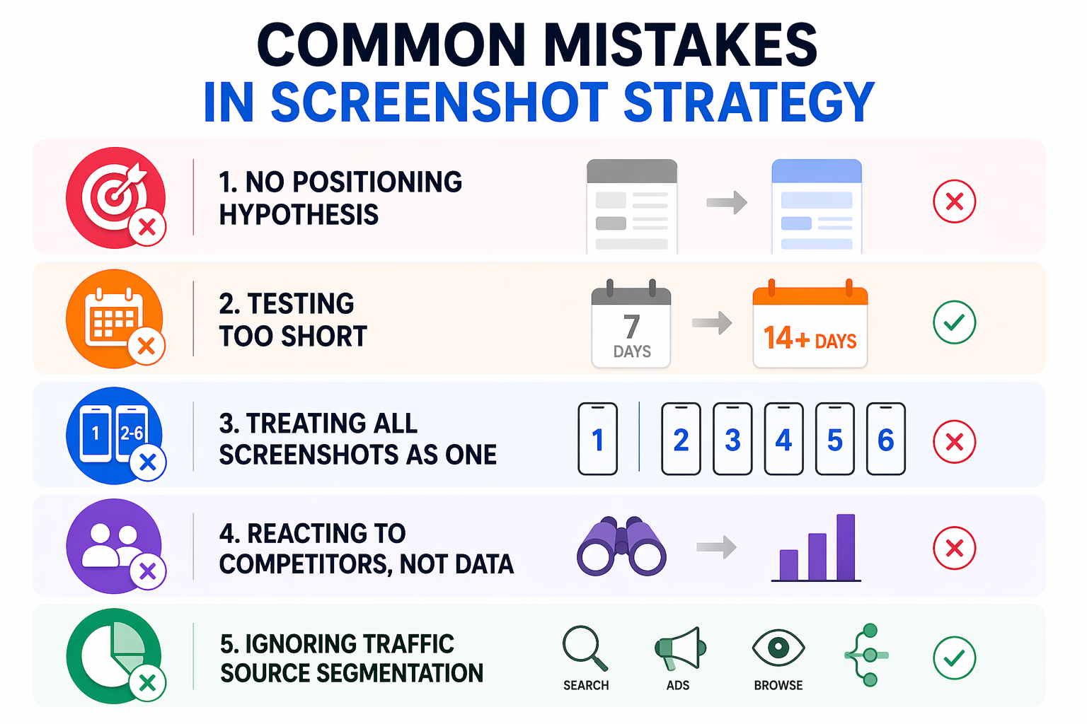
Common Mistakes in Screenshot Strategy
Testing visuals without a positioning hypothesis Changing colors or layout without a clear reason produces results that cannot be replicated or built upon. Always start with the competitive gap, not the design change.
Running tests too short Two weeks is the minimum for most apps. Under-powered tests produce false positives that reverse when deployed at full traffic. Use the PPO dashboard to track confidence levels and wait for 95% before calling the test.
Treating screenshot 1 and screenshots 2–6 as one unit Screenshot 1 is primarily a hook, it determines whether users tap into the page or keep scrolling in search results. Screenshots 2–6 convert users who are already interested. These are different jobs. Test them separately when your traffic volume supports it.
Updating screenshots in response to competitors rather than data If your CVR is strong, a competitor's screenshot redesign is not a reason to change yours. React to your own performance data, not to what competitors appear to be doing.
Ignoring traffic source segmentation CVR from organic search behaves differently than CVR from Apple Search Ads or Browse traffic. A screenshot set that performs well for high-intent search traffic may underperform for lower-intent Browse traffic. Segment your PPO results by source when your data allows it.
The App Store Algorithm Signal You Are Actually Optimizing For
This is worth stating directly: when you improve CVR through screenshots, you are not just improving a conversion metric. You are sending a stronger quality signal to the App Store algorithm.
The algorithm's ranking logic is a closed feedback loop: impressions lead to taps, taps lead to installs, installs confirm relevance. A higher CVR means more installs per impression, and that install velocity is one of the strongest ranking signals the algorithm responds to. Improved screenshot CVR, sustained over several weeks, will typically produce improved keyword rankings for the terms driving that traffic. The screenshot and the ranking are connected.
This is also why the timing of creative tests matters. After a metadata update, Apple typically grants a temporary visibility boost, increased impressions over roughly the first week post-update. Running a screenshot refresh alongside a metadata update, during that boost window, means your higher-intent traffic spike lands on a more optimized conversion experience. The algorithm sees improved conversion during the boost period and is more likely to sustain the ranking lift beyond it.
Bonus Insight: Better Rankings Unlock Better Apple Ads Performance
The ranking lift you earn from CVR compounds in a second place most teams miss: Apple Search Ads. A higher organic rank signals relevance to Apple, and relevance is what actually unlocks paid spend in the auction. We've seen cases where a client bids nearly twice as high as a competitor on the same keyword and spends a fraction of what the competitor spends, because the competitor has an organic ranking and the client does not. Apple rewards relevance with delivery, even at lower bids. This is OWA's POV on why ASO and Apple Search Ads cannot be run as separate workstreams: the same signal drives both.
Full breakdown, with the data, here.
FAQ
How many competitors should I analyze for a screenshot audit?
Five to seven direct competitors gives you enough data to identify category patterns without creating an unmanageable dataset. Start with the top five apps ranking for your highest-priority keywords, these are the apps already winning the search results you are targeting. Add one or two adjacent competitors if they occupy a positioning you want to understand.
How long should a screenshot A/B test run on the App Store?
Minimum two weeks, typically four. The right duration depends on your download volume, you need enough install events to reach statistical confidence (95% or above). For apps with fewer than 5,000 monthly installs, four weeks is a more reliable threshold. For higher-volume apps, two weeks may be sufficient. Never end a test early because the early numbers look good.
Does changing screenshots affect my App Store keyword rankings?
Screenshot changes do not directly affect keyword indexing, that is driven by metadata (Title, Subtitle, Keyword Field). However, screenshot improvements that lift CVR indirectly support rankings by increasing install volume per impression, which is a core algorithmic signal. Sustained CVR improvement following a screenshot update typically correlates with improved ranking stability over 3–6 weeks.
What is Product Page Optimization (PPO) and how does it work?
Product Page Optimization is Apple's native A/B testing feature in App Store Connect. It allows you to test up to three creative treatment variants (screenshots, app preview video, or app icon) against your default product page. You control the traffic split, typically 50/50 for a single treatment and Apple reports conversion rate results broken down by treatment and traffic source. Tests run inside the App Store with no external tooling required.
Should I change screenshots if my CVR is already above category average?
Only if you have a clear positioning hypothesis and a competitive gap to test against. If your CVR is strong, the risk of a screenshot change is that it disrupts a signal the algorithm has already rewarded. Run a PPO test rather than making a direct swap; this lets you validate the hypothesis without exposing 100% of your traffic to an unvalidated change.
Your Next Step
The competitive gap in your category already exists. The audit finds it. Almost no one runs the audit.
This week: pull the screenshot sets for your top five competitors. Map the Hook → Pain → Solution narrative for each. Look for the pattern that appears in four or more of them that is your category default. Then look for what is completely absent. That absence is your test brief.
The screenshot strategy that wins is not the prettiest one. It is the one positioned where no one else in your category has been willing to stand. Find that position, test it rigorously, and let the CVR data decide.
If your team is running ASO and Apple Search Ads as two separate workstreams and the numbers are not adding up, that is the exact problem we solve with clients.