Google Play Visual Assets & Specifications: Guidelines and Best Practices
Understanding the Google Play Store's visual assets and specifications is crucial for any app developer aiming to maximize their app's visibility and user engagement. In this comprehensive guide, we delve into the best practices and guidelines for Google Play's visual assets, including app icons, screenshots, and preview videos. This article serves as a one-stop resource for developers seeking to optimize their app's appearance on one of the world's largest app distribution platforms, ensuring that it not only adheres to Google's standards but also stands out in a competitive digital marketplace.Launching an app on the Google Play Store involves more than just coding and functionality. One critical aspect that should never be overlooked is the presentation of your app through visual assets like icons, screenshots, and videos. These elements significantly influence users' decisions to download and engage with your app.
Preparing visual assets for the Google Play Store requires a balanced approach that adheres to Google's guidelines while embracing effective design principles. Compared to the Apple App Store, the Google Play Store offers a more streamlined set of rules, making it relatively easier for developers to meet the standards. However, it's not just about technical compliance; applying strategic design approaches is crucial. These best practices are proven to enhance user engagement and boost conversion rates.
In this article, we will guide you through not only the technical specifications but also share expert design tips to significantly elevate your app's appeal and performance in terms of conversion rate optimization (CRO) in the Google Play Store.
**Google Play Visual Asset Guidelines**
Google Play Store Screenshot Guidelines
In the realm of mobile applications, first impressions are often the deciding factor for success. For developers looking to launch or update their app on the Google Play Store, understanding and adhering to the screenshot guidelines is pivotal. These guidelines not only ensure compliance with Google's standards but also play a crucial role in how potential users perceive and interact with your app. In this section, we delve into the Google Play Store's specific requirements for screenshots, offering insights and tips to help you showcase your app effectively and attractively, thus enhancing user engagement right from the first glance.
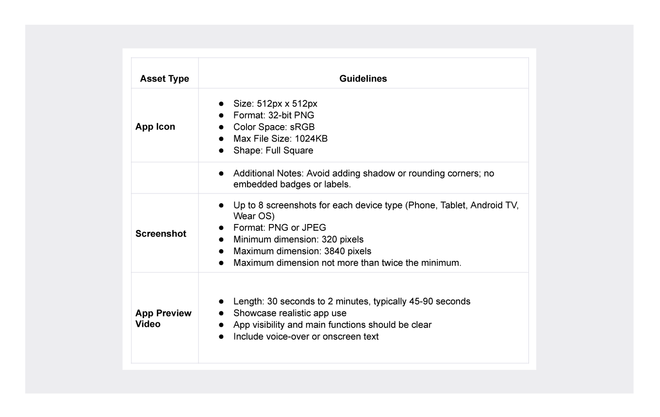
Key requirements for Google Play Store screenshots:
- You can upload up to 8 screenshots for each supported device type: Phone, Tablet (7 inch & 10 inch), Android TV, and Wear OS.
- Screenshots should be in PNG or JPEG format, with a minimum length of 320 pixels and a maximum length of 3840 pixels. The maximum dimension of your screenshot can't be more than twice as long as the minimum dimension.
Best Practices for Captivating Play Store Screenshots
To make your app stand out in the Google Play Store, consider the following:
- Quick Impact Like a Highway Billboard: Treat each screenshot as if it has only five seconds to make an impression, similar to a highway billboard. Use text sparingly and rely heavily on images. Each screenshot should quickly convey key benefits and entice users.
- Consistent Branding with Color Choices: Select screenshot colors from your app's color palette to maintain consistent branding from the app store to the user experience.
- Reflecting Emotional Tone: Ensure that the screenshots match the style and objective of the app, reflecting its emotional tone, whether it be professionalism for finance apps or whimsy for games.
- Utilize All Available Screenshot Slots: Make use of all eight screenshot slots provided by Google Play. This approach allows you to showcase various aspects of your app effectively.
- Order of Importance: Arrange screenshots in order of their importance, with the most significant value proposition displayed first. This organization helps in capturing the user's attention immediately.
- Simplicity and Clarity: Keep screenshots self-explanatory, using minimal text to highlight different points, without overwhelming the visuals.
- Responsive to Market Needs through Localization: Adapt your screenshots to meet the needs of your target users. This involves more than just translating text; it's about understanding and responding to regional expectations and beliefs.
- Regular Updates and Experimentation: Stay updated with the latest trends and market dynamics. Regularly update and experiment with your screenshots, and consider running A/B tests to determine the most effective ones.
- Resolution and Aspect Ratio: For most apps, use at least four screenshots with a resolution of 1080 pixels. For games, include at least three screenshots in a 16:9 aspect ratio. These screenshots should give a clear view of the in-game experience.
- Focus on Core Features and Benefits: Ensure that the screenshots highlight the core features and benefits of the app, giving users a clear overview of what to expect before downloading.
- Avoid Overuse of Promotional Language: Refrain from using promotional or action-inducing words in the screenshots, such as "top", "best", "new", and "download now".
- Storytelling through Screenshots: Arrange the screenshots like a storyline to give the user a clear understanding of the app's functionalities and benefits, pre and post-download.
Best Examples from Google Play Store
In this part of the article, we will give you insights into the screenshots of some apps that you can currently see on the Google Play Store. We will make some comments and talk about the good aspects of the three different sets of screenshots we chose.
Microsoft Teams
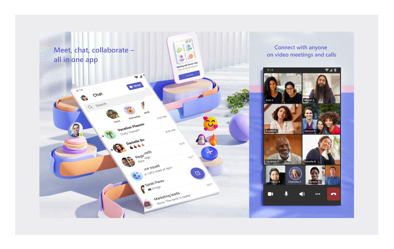
Microsoft has actually managed to create a similar design language in all its published apps. The most notable of these is undoubtedly Microsoft Teams. The Microsoft design team, which has shown great workmanship, especially in the first screenshot, has managed to create eye-catching screenshot sets. The first two screenshots look very nice in terms of design and also contain UI elements. In this way, Microsoft has combined both UI elements and designs that look good enough to attract the attention of its users.
Vivino
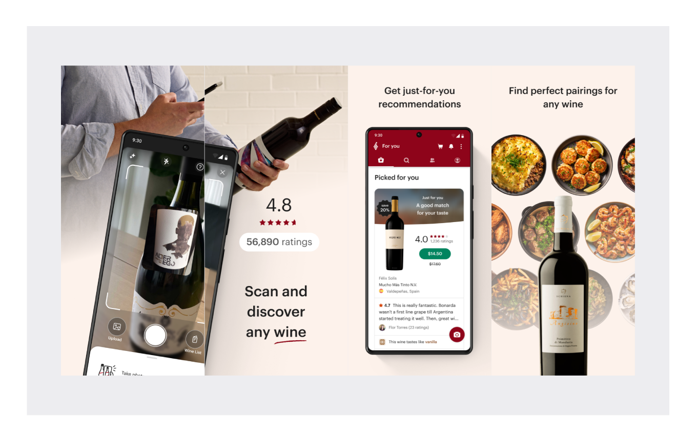
There are two different points we want to draw attention to in Vivino's screenshots. The first is that the app's value proposition is directly shown in the first screenshot. The second thing is to include social proof in the second screenshot.
Vivino has managed to create a powerful conversion tactic by combining the strengths of the app with comments from users.
App Icon Guidelines
The app icon is often the first point of interaction with potential users. Here are the specifications and some tips for creating an effective app icon:
- Google Play requires a 512 x 512 pixels app icon.
- The icon should be a 32-bit PNG (with alpha).
- Design a visually appealing and memorable icon that encapsulates your app’s essence.
- Test different designs to see which resonates most with your target audience.
App Icon Best Practices
- Simplicity: Keep your icon design clean and straightforward, avoiding too many details or colors. This makes it easily recognizable at a glance.
- Strategic Color Use: Colors are crucial in app icon design. Choose a palette that complements your app's purpose and makes it stand out. Bold, contrasting colors can be particularly effective.
- Shape Focus: The shape of your app icon is as important as its color and design. Choose a distinctive, memorable shape that is recognizable in various sizes and resolutions.
- Consistency: Maintain a consistent design across all your branding materials, using the same color scheme, typography, and design elements.
Best Examples from Play Store
In this segment, we delve into the world of app icons, a crucial aspect of app presentation in the digital marketplace. App icons are more than mere graphical representations; they are the first point of engagement between the app and its potential users. They serve not only as a branding tool but also as a medium to convey the app's essence at a glance.
Headspace: Headspace is a meditation and mindfulness app with a simple but effective icon. The white lotus flower on a blue background is calming and inviting, and the soft colors suggest peace and tranquility.
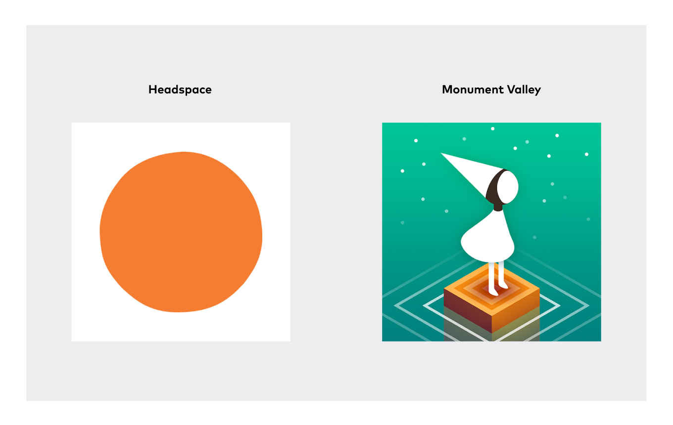
Monument Valley: Monument Valley is a puzzle game with a beautiful and unique icon. The geometric shapes and vibrant colors are eye-catching, and the overall design is both mysterious and inviting.
App Preview Video Guidelines
App preview videos can significantly increase user engagement. Here are the guidelines:
- Videos should be localized and informative, showcasing the app’s core features and functionality.
- You can use up to three videos, with each video having a duration between 30 seconds to 2 minutes.
- Supported video formats include MP4 or YouTube links.
App Preview Video Best Practices
- Video Length: The ideal length for a Google Play video is between 30 seconds to 2 minutes. Most successful videos fall within the 45-90 second range, providing enough time to showcase the app's features without losing the viewer's attention.
- Realistic Demonstration: Display realistic use of the app, including actual interaction. Showing hands touching the screen, for example, makes it easier for viewers to understand how the app works compared to just showing the app interface.
- Clarity and Visibility: Ensure that the app and its main functions are clearly visible in the video. This helps viewers quickly grasp what your app does and how it can benefit them.
- Voice-over or Onscreen Text: Including a voice-over or onscreen text to explain what's happening in the video can significantly enhance understanding, especially if the recording is clear and engaging. This is particularly important if your app's functionality isn't immediately obvious from the visuals alone.
- Versatility of Use: Google Play videos are essentially promotional videos that can also be used on social media, video sharing sites, your website, or in press releases. This versatility allows you to get more mileage out of your video content.
- A/B Testing: Google Play allows A/B testing of your videos. This means you can experiment with different versions of your video to see which one performs best in terms of user engagement and app downloads.
These practices aim not just to meet Google Play's technical requirements but also to create a compelling narrative around your app, enhancing its appeal to potential users. Remember, a well-crafted app preview video can be a powerful tool in your app marketing strategy.
Best Preview Videos
My Heritage App
The My Heritage App preview video is well-produced and informative. It does a good job of explaining the features of the app and showing how it can be used to learn more about your family history. The video is also visually appealing, with a mix of real-world footage and animation.
TourBuds
The TourBuds app preview video is well-produced and informative. It does a good job of explaining the features of the app and showing how it can be used to plan and execute audio tours. The video is also visually appealing, with a mix of real-world footage and animation.
Here are some specific things that I liked about the video:
- The video starts with a strong hook: A group of friends are having a fun and engaging experience while using the TourBuds app to explore a new city. This immediately grabs the viewer's attention and makes them want to learn more.
- The video does a good job of explaining the key features of the app: The ability to create and share custom audio tours, access pre-made tours, and download tours for offline use. The video also highlights the app's user-friendly interface and social features.
- The video is well-paced and engaging: It keeps the viewer's attention throughout by using a variety of different shots and editing techniques, as well as upbeat music and sound effects.
- The video is visually appealing: The use of real-world footage, animation, and special effects is effective, and the overall look and feel of the video is consistent with the brand identity of the app.
- The video ends with a clear call to action: Download the TourBuds app.
Conclusion: Maximizing Impact with Visual Assets
In the competitive landscape of the Google Play Store, it's crucial to leverage every opportunity to attract and retain users. By adhering to the platform's specifications and employing creative strategies in designing your app's visual assets, you can significantly enhance your app's appeal, driving higher conversion rates and success in the digital marketplace.
Ready to optimize your app's presence on the Google Play Store?
[Contact us to develop a tailored strategy that caters to your app's unique needs and market dynamics.