App Store Visual Assets’ Specifications: Guidelines and Best Practices
When you're about to launch your app on the Apple App Store, one crucial aspect you shouldn't overlook is the presentation of your app through your icon, screenshots, and videos. These visual elements play a significant role in influencing potential users to download your app. In this article, we'll delve into the importance of optimizing your app's icon, screenshots, videos and guide you through the essential size requirements set by [Apple.
App Store Screenshot Guidelines
Here are some key Apple App Store screenshot requirements:
- You can upload up to 10 screenshots on your App Store product page.
- Screenshots must be in flattened JPEG or PNG RGB file format with 72 dpi resolution and no transparency.
- Each screenshot should fit the mandatory screen resolutions defined by the Apple App Store.
- Additionally, Apple encourages you to showcase how users interact with your app through UI screens. All UI screens must be taken from within the app, ensuring that you have intellectual property rights for the elements you upload.
Keep in mind that Apple regularly introduces new features with iOS updates, and incorporating these features into your screenshots can give your app a competitive edge in the App Store.
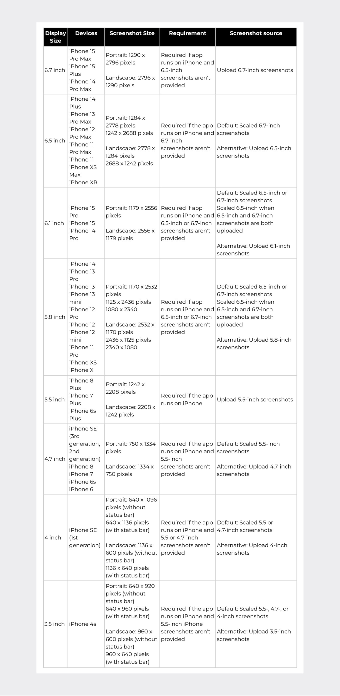
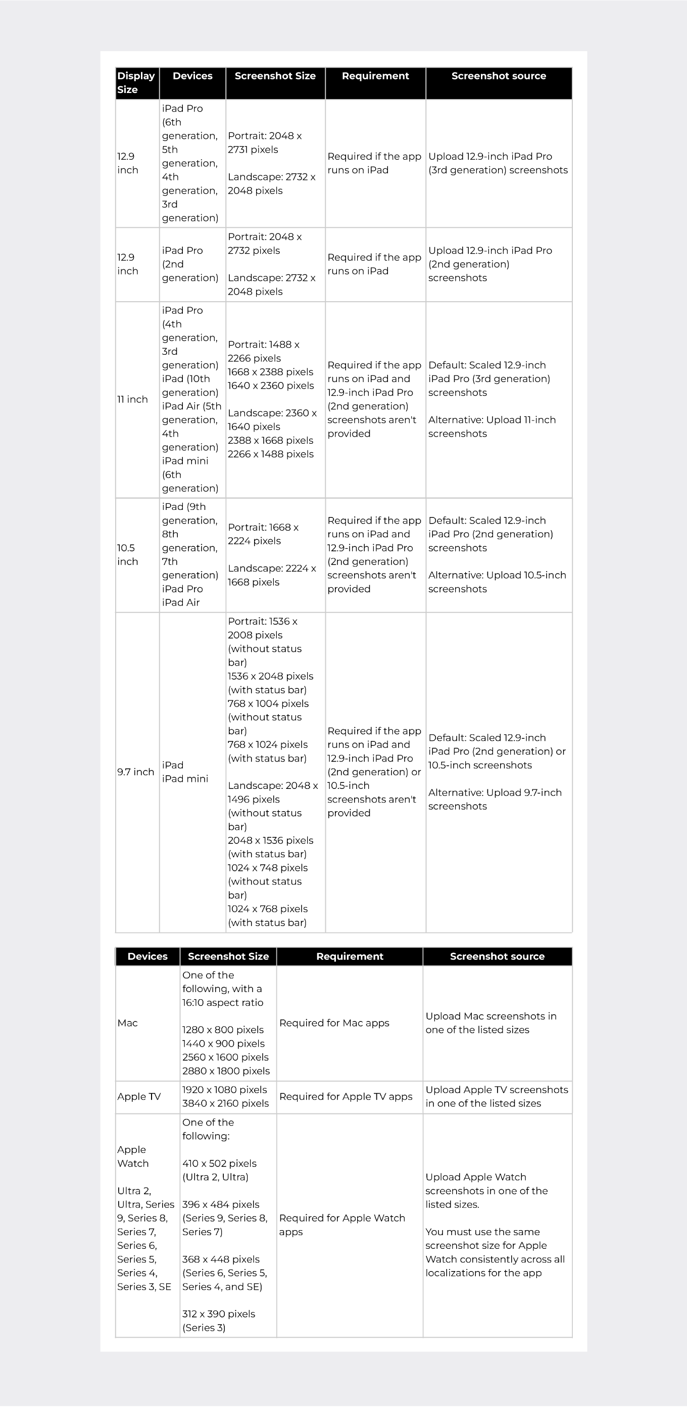
Ensuring your screenshots adhere to Apple's device-specific size requirements is crucial for optimal presentation. Here are the essential dimensions for various iOS devices based on the App Store's official [Screenshot Specifications Guideline:
Creating Outstanding App Screenshots to Drive Conversion Rates Higher
Your app's screenshots are often the first impression potential users get when they stumble upon your app in the App Store search results. These visuals appear alongside your app's name and subtitle, making them crucial for capturing the attention of users and convincing them to explore your app further.
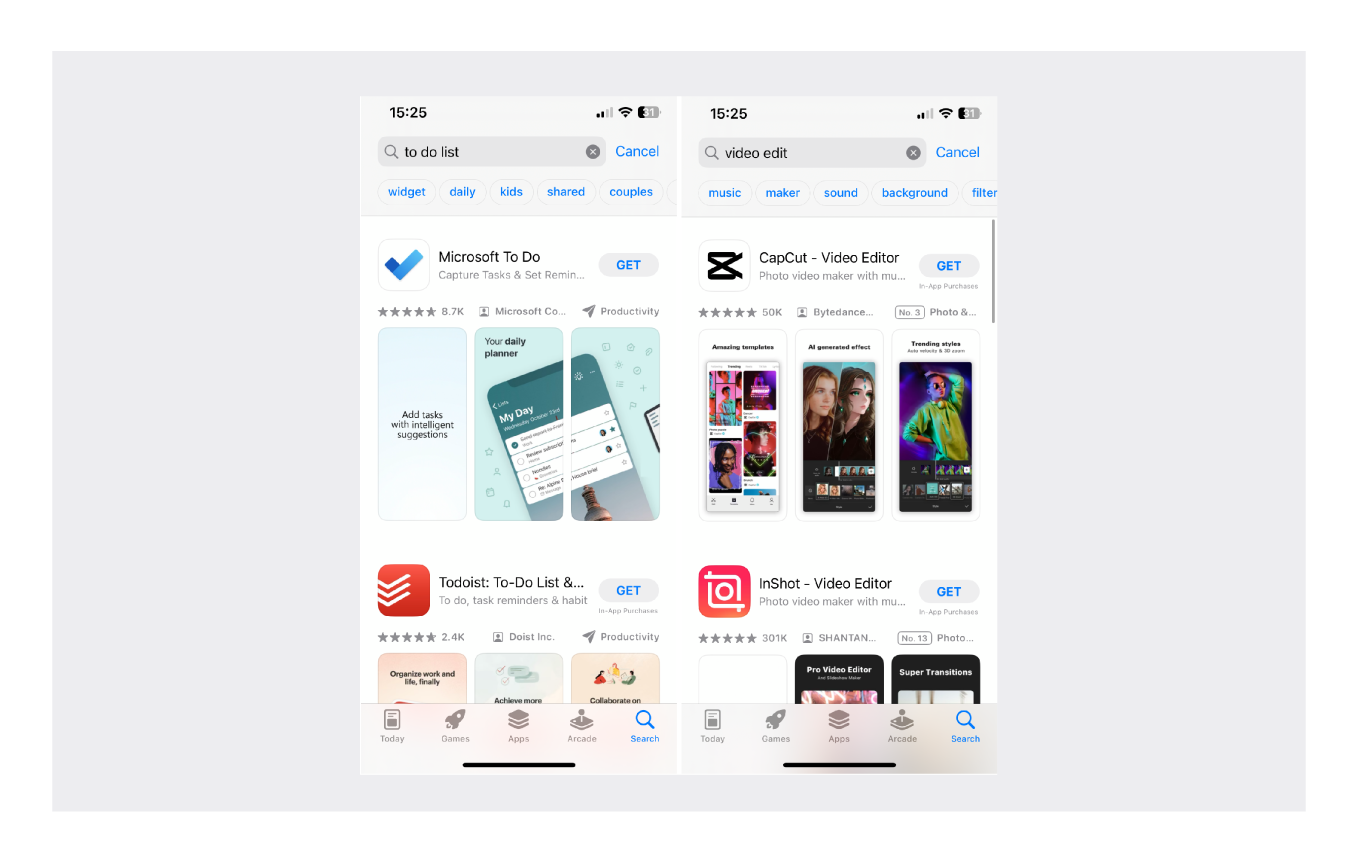
Search Results in App Store
The importance of screenshots is twofold: there's a general importance, and an even greater significance when it comes to the search channel. Understanding their impact is key, especially given that approximately 60% of downloads come from search traffic source.
When it comes to creating these screenshots, arranging them thoughtfully is crucial. Prioritize the most important features and benefits at the beginning to make a strong initial impression. This strategy ensures that, even if users don't scroll further, your app still stands out.
An additional factor to consider is that the first three screenshots serve as the only visuals that users encounter along with the app icon if they don't tap to access the product page. This is precisely why we place a heavy emphasis on these initial three screenshots.
- Experiment with various caption styles, fonts, and placement.
- Rearrange the order of your screenshots to find the most compelling sequence.
- Adjust the in-app content in your screenshots to emphasize user-favored features.
- Explore different background styles and custom design elements.
- Test various display styles, including captions and phone visibility.
Here are some apps that nailed App Store screenshot best practices:
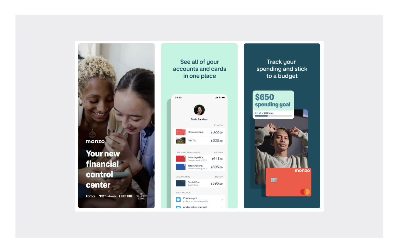
Monzo - Mobile Banking
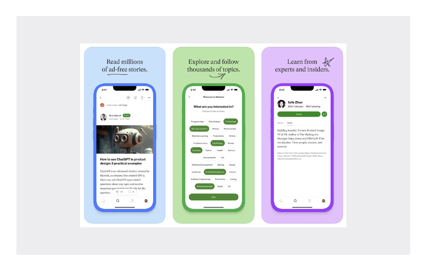
Medium: Read & Write Stories
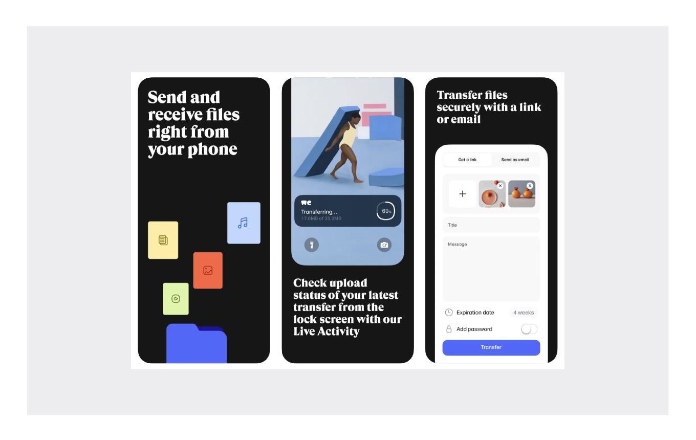
WeTransfer: Transfer Files
App Preview Video Sizes & Guidelines
The App Store allows you to upload app preview videos. These videos, similar to screenshots, have a significant impact on conversion rates. You can have up to three videos in portrait or landscape mode, with each portrait video replacing one portrait screenshot.
Here are some general guidelines for app preview videos:
- Videos should be 15 to 30 seconds long.
- The video file size should not exceed 500 MB.
- Supported video formats include H.264 and ProRes 422 (HQ), with accepted extensions like .mov, .m4v, and .mp4 for H.264.
- Your app preview videos should focus on showcasing the app’s actual UI & UX and gameplay. Avoid promotional content or copyrighted material. These videos use the autoplay feature, making them an effective tool for highlighting your app's best elements.
iPadOS, macOS, tvOS, and watchOS App Screenshot Sizes
In addition to iPhones, Apple has size requirements for screenshots on iPadsMacs, Apple TVs, and Apple Watches. These requirements vary depending on the device, so make sure to consult Apple's guidelines for the precise dimensions.
Requirements and Guidelines for App Icons
App icons are more than just small graphics on your device's screen. Your app's icon is the first impression users get of your application. It's the virtual handshake that can lead to a successful app or a forgotten one.
In fact, they are among the most influential elements on the app store's product page, playing a critical role in your app's organic growth. On average, a well-designed app icon can potentially increase conversions by 10-25%, and in some cases.
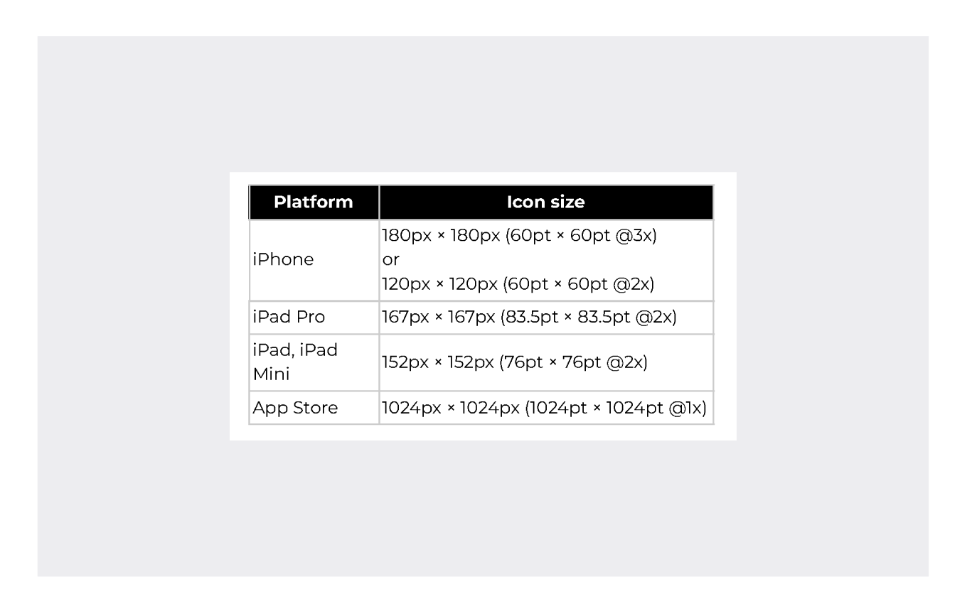
To meet Apple's rigorous standards, it's crucial to get your app icon's size and resolution right. App icon sizes can vary widely, depending on the platform and device requirements. For iOS devices, you'll commonly use an app icon size of 180x180 pixels at @3x resolution. However, remember the smaller version at 120x120 pixels, referred to as @2x, for older devices and lower resolutions. Android and other platforms have their own size recommendations, so be sure to tailor your icon accordingly.
Apple's expectations for app icons are quite specific, and it's essential to follow their technical requirements. You must also adhere to size specifications for various devices.
Best Practices for iOS App Icons
Size and resolution are only part of the equation. To make your app icon truly effective, consider these best practices:
- Opt for an icon style that resonates with your target audience and accurately represents your app's purpose. An icon that appeals to your intended users increases the likelihood of downloads.
- Ensure your icon is visually appealing, well-composed, and easy to understand. It should be a captivating visual representation of your app.
- Using transparency in your icon design is not advisable since it can lead to inconsistencies in how your app appears on different users' devices.
- Apple will automatically apply a mask with rounded corners to your icon, so it's best to maintain square corners in your icon's design.
- Don't finalize your icon design without testing. A/B testing allows you to gauge its effectiveness and make informed decisions based on user responses.
.png)
In the competitive world of app development, it's not just about keywords; conversion rates are the name of the game. To expand your app's reach effectively, you need a structured strategy and insightful experimentation.
Why not take the next step? [Book a meeting with us today, and let's dive into creating a strategy that ensures you reach and convert the ideal users!